


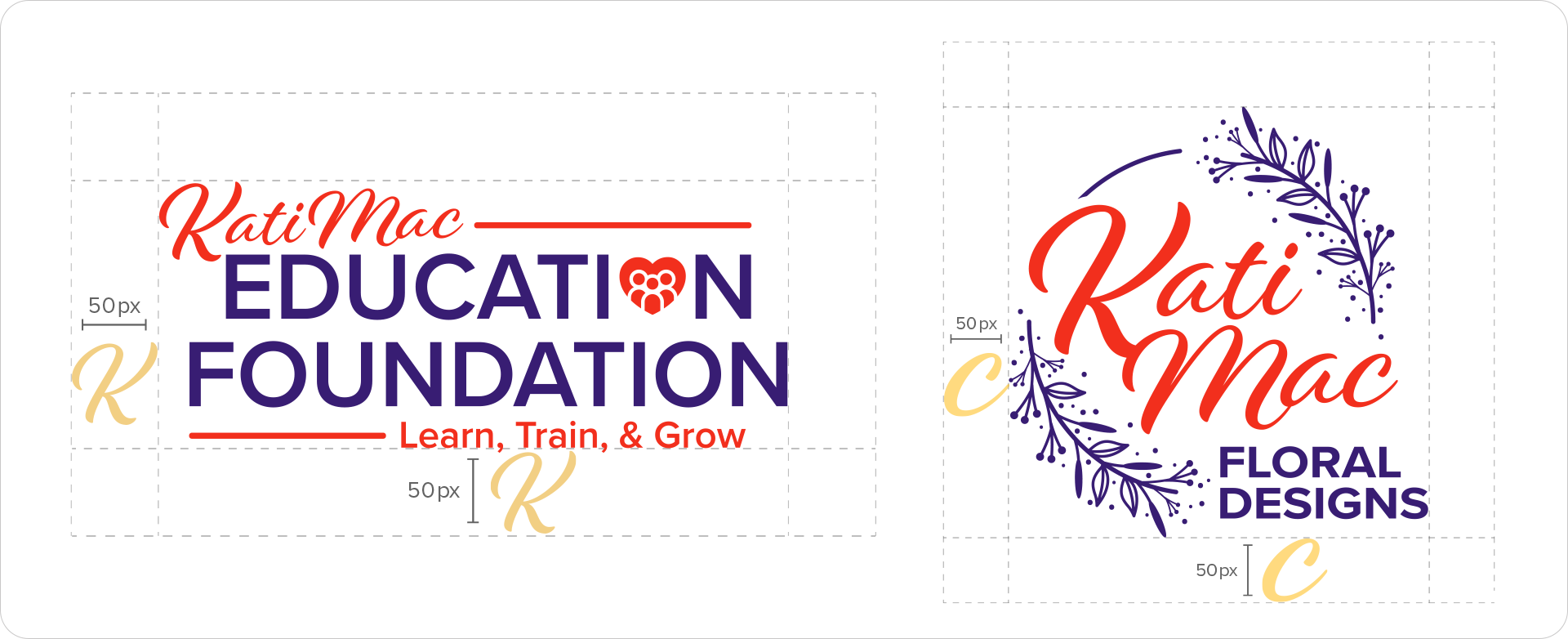
Dual Logo Concepts for Kati Mac Floral Designs & The Kati Mac Education Foundation
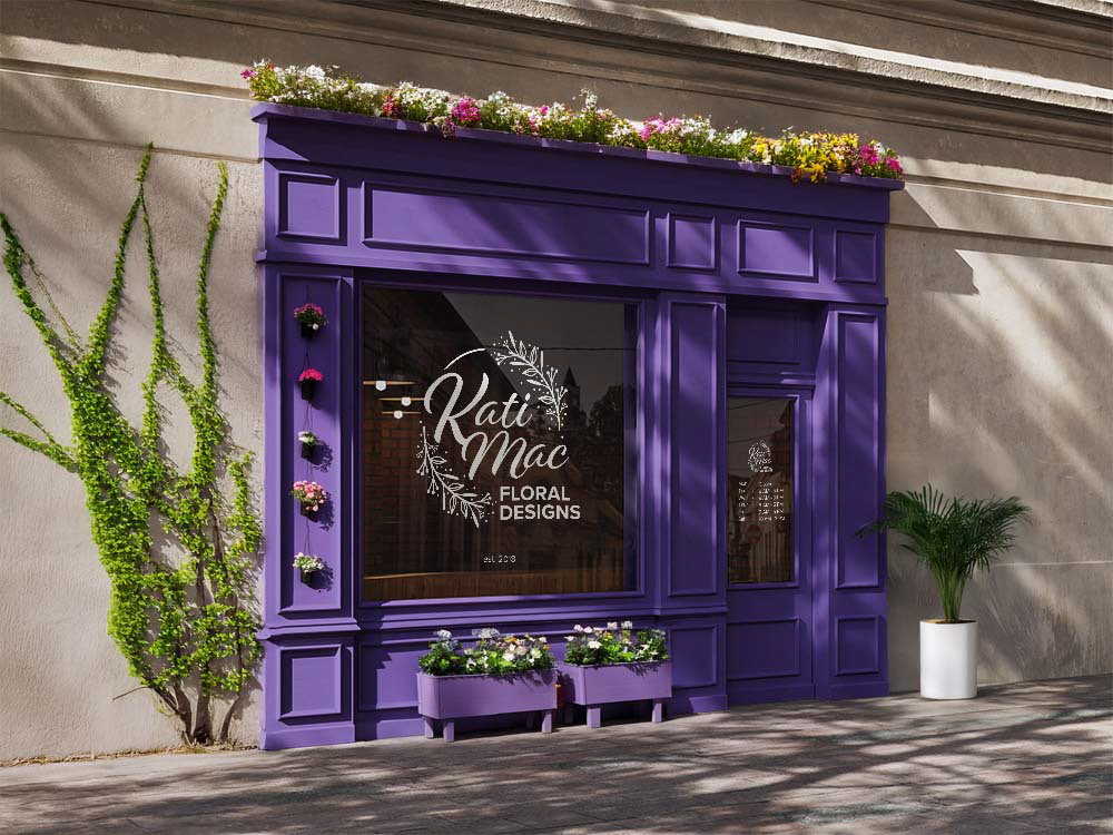
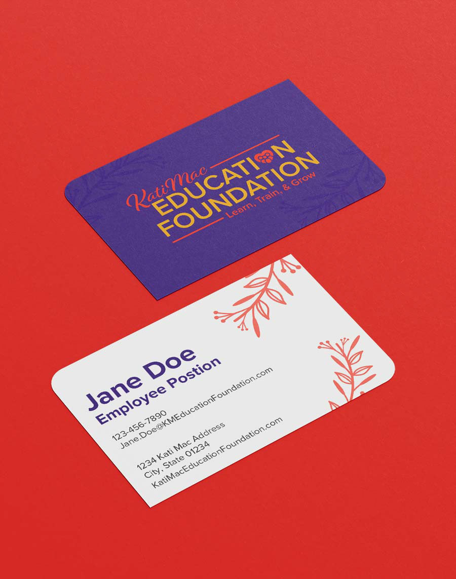
Kati Mac Floral Designs is a floral shop that is supported by The Kati Mac Education Foundation, a nonprofit organization. While the two are closely linked, each serves a distinct purpose and must be represented individually.
Objective: Design Two Complementary Logos
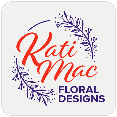
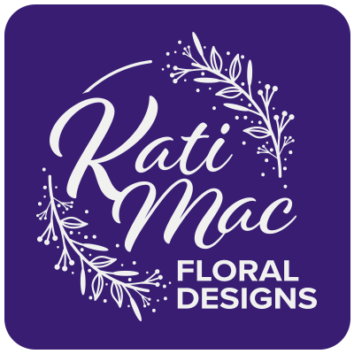
Kati Mac Floral Designs – representing the floral retail business.
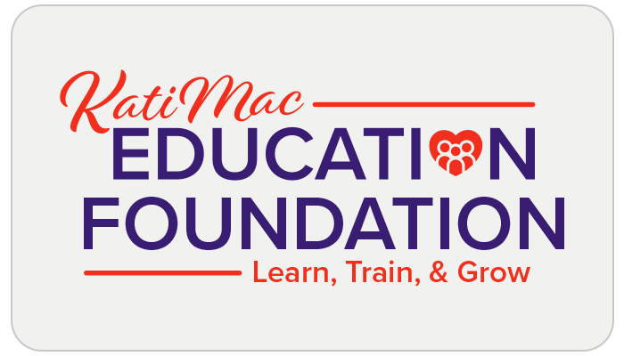
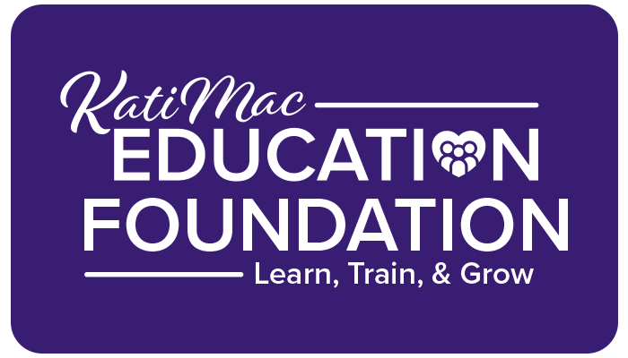
The Kati Mac Education Foundation – representing the charitable organization that supports the shop’s mission.
The logos should be visually connected (e.g., through style, typography, or color palette) to reflect their relationship, yet distinct enough to stand alone and represent their unique identities.


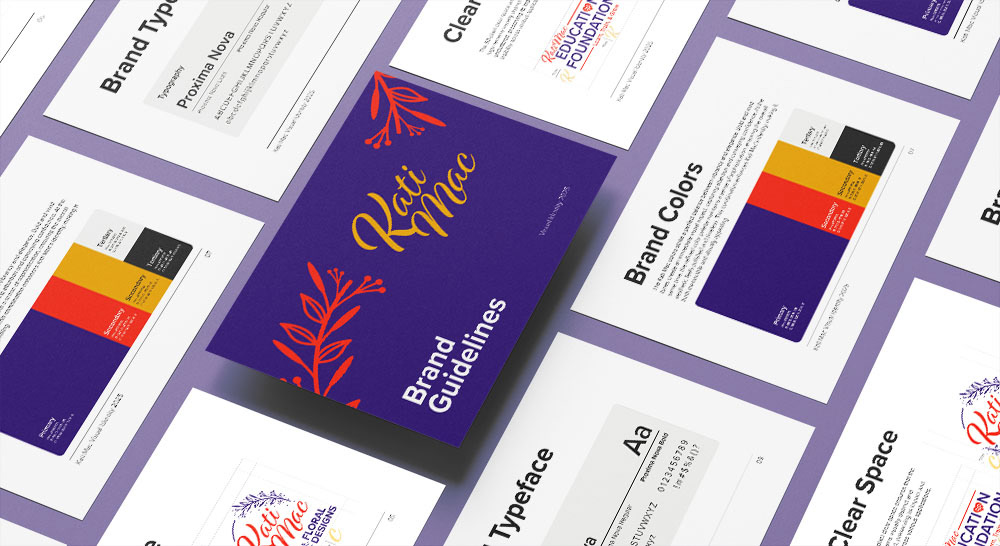
Clear Space
The 50-pixel clear space ensures that the logo remains visually distinct and uncluttered, preserving its impact and legibility across various applications.
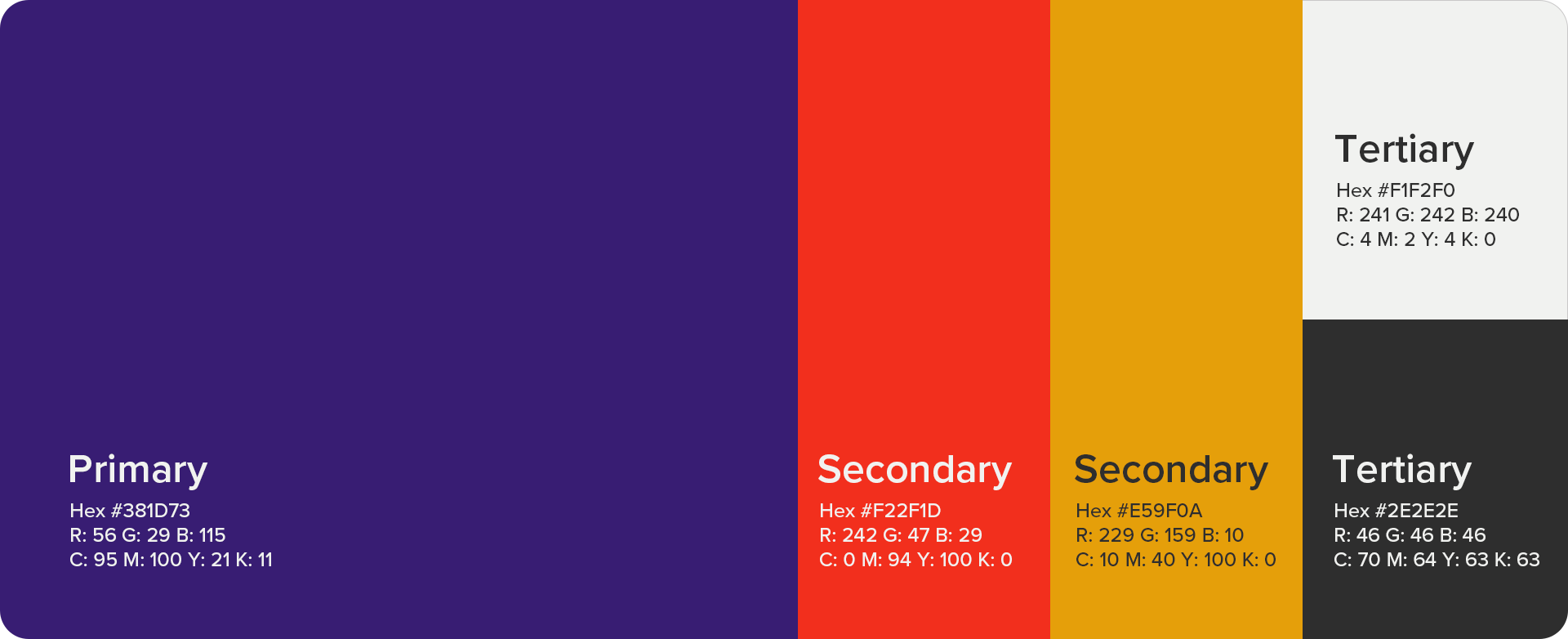
Brand Colors
The Kati Mac colors strike a perfect balance between vibrancy and elegance. Bold and vivid tones create an immediate visual impact, capturing attention and conveying confidence. At the same time, the refined color palette maintains a sense of sophistication, ensuring the overall aesthetic feels polished and timeless. This combination enhances Kati Mac’s identity, making it both memorable and visually appealing.
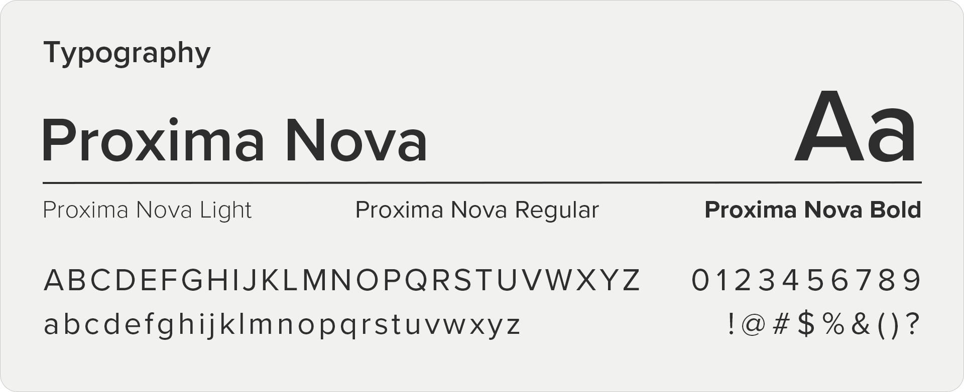
Brand Typeface
Proxima Nova is the perfect fit for Kati Mac Floral Designs and Kati Mac Education Foundation logos because it seamlessly blends modern versatility with a clean, approachable aesthetic. Its geometric yet friendly letterforms offer a professional and contemporary feel that resonates across both the creative, design-driven identity of the floral business and the purposeful, community-centered mission of the education foundation. The font’s clarity ensures strong readability in both print and digital formats, while its subtle elegance reinforces the brand’s cohesive and trustworthy image across different ventures.

This project and assets belong to Stream Companies, LLC.