OBJECTIVE
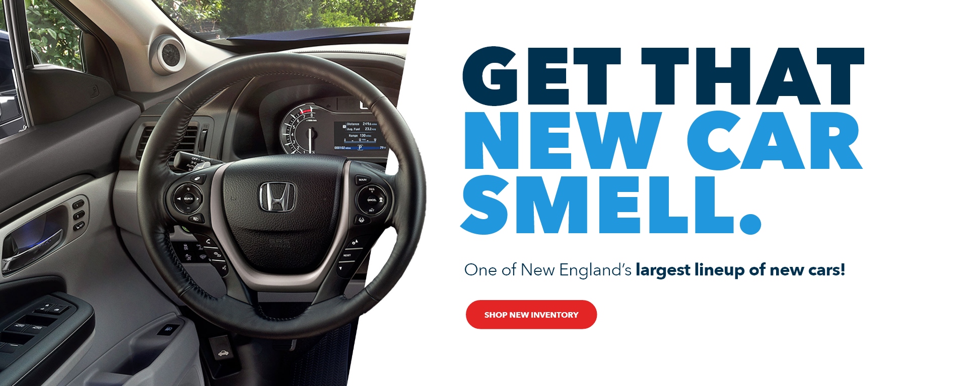
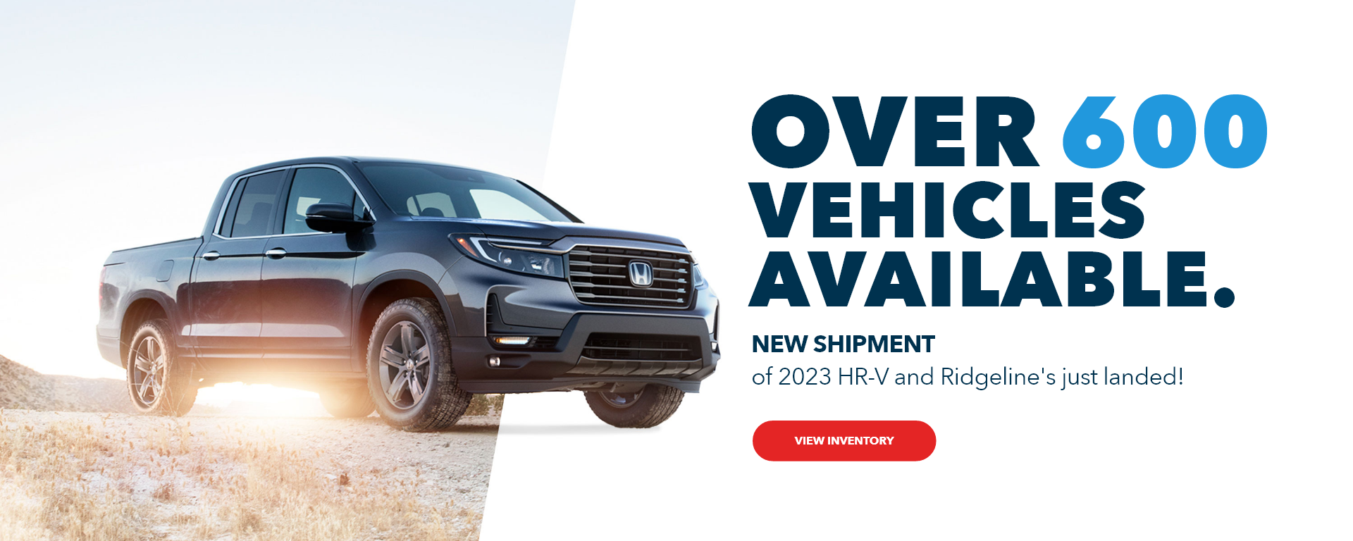
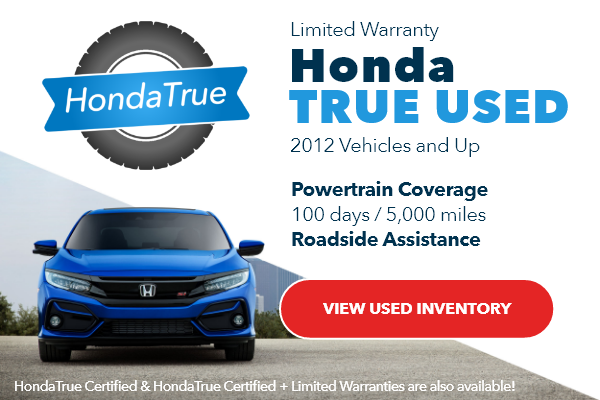
I was tasked with altering the previous set of website banners by incorporating a modern layout, vibrant visuals, and a refreshed design to enhance the brand's online presence.
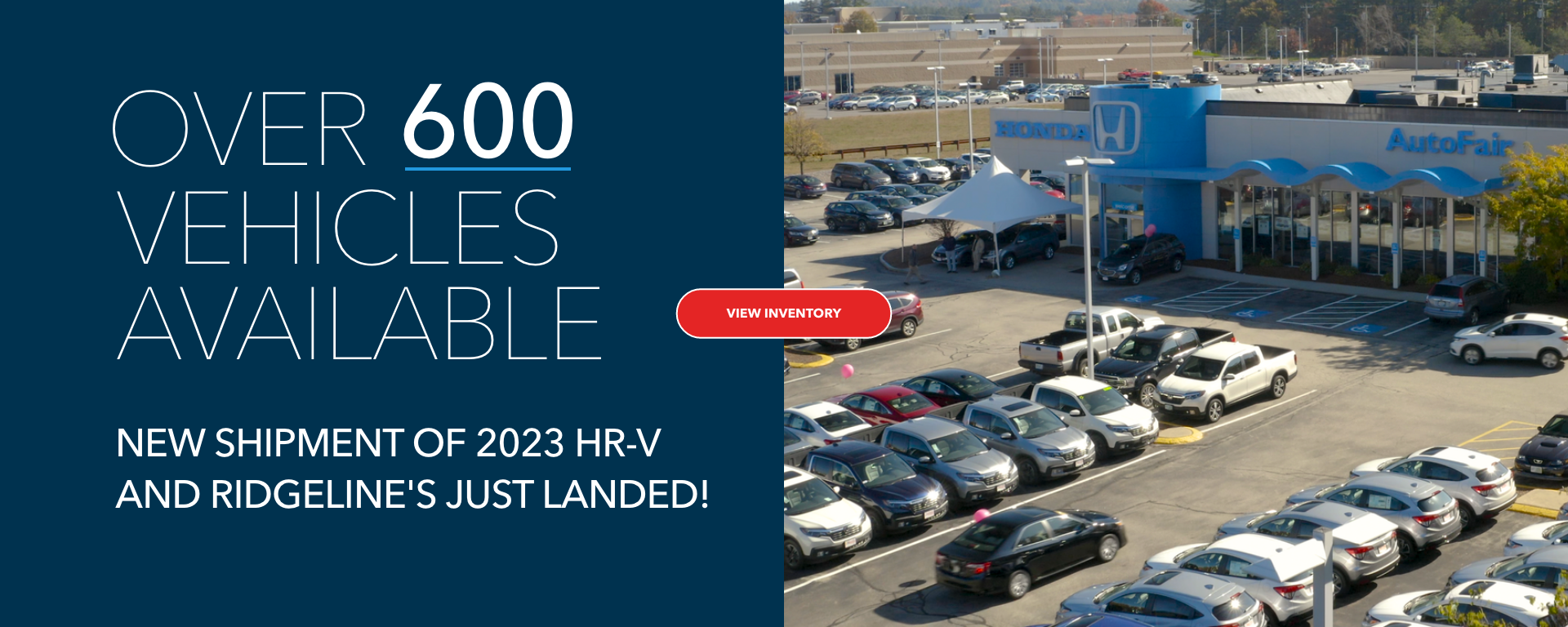
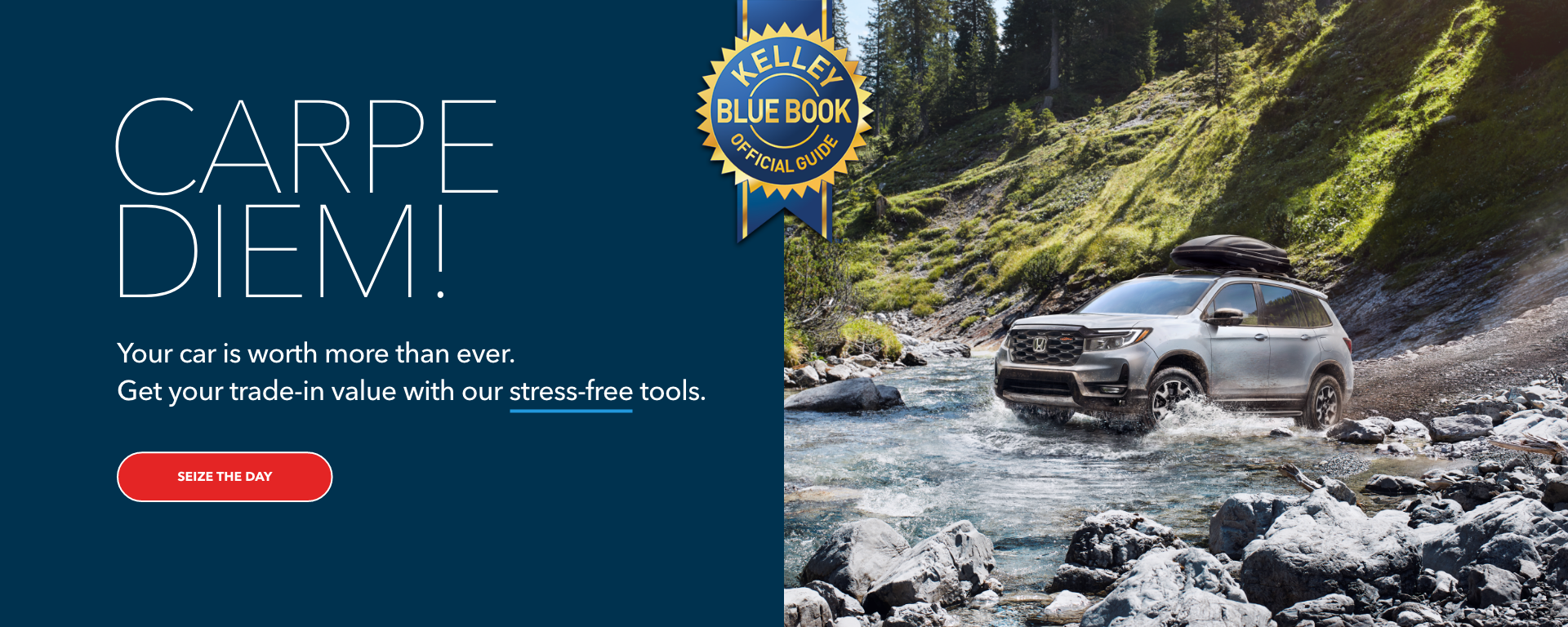
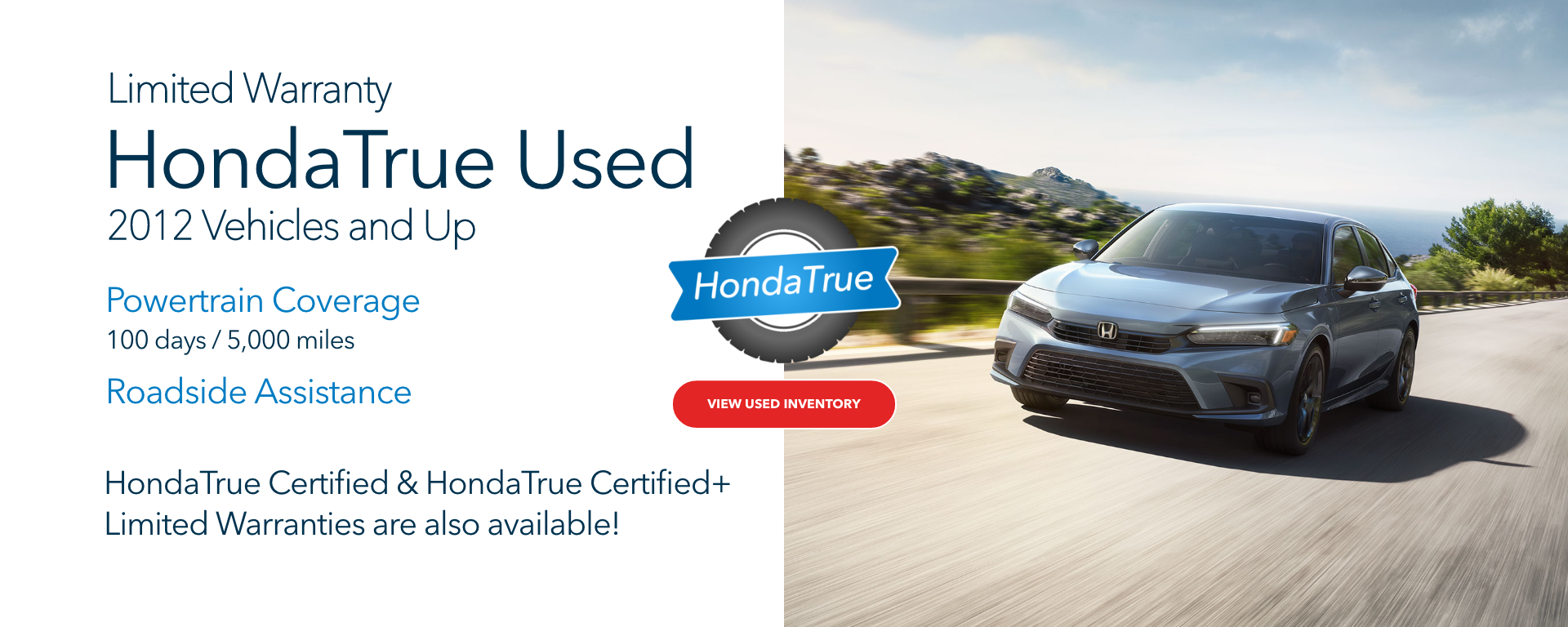
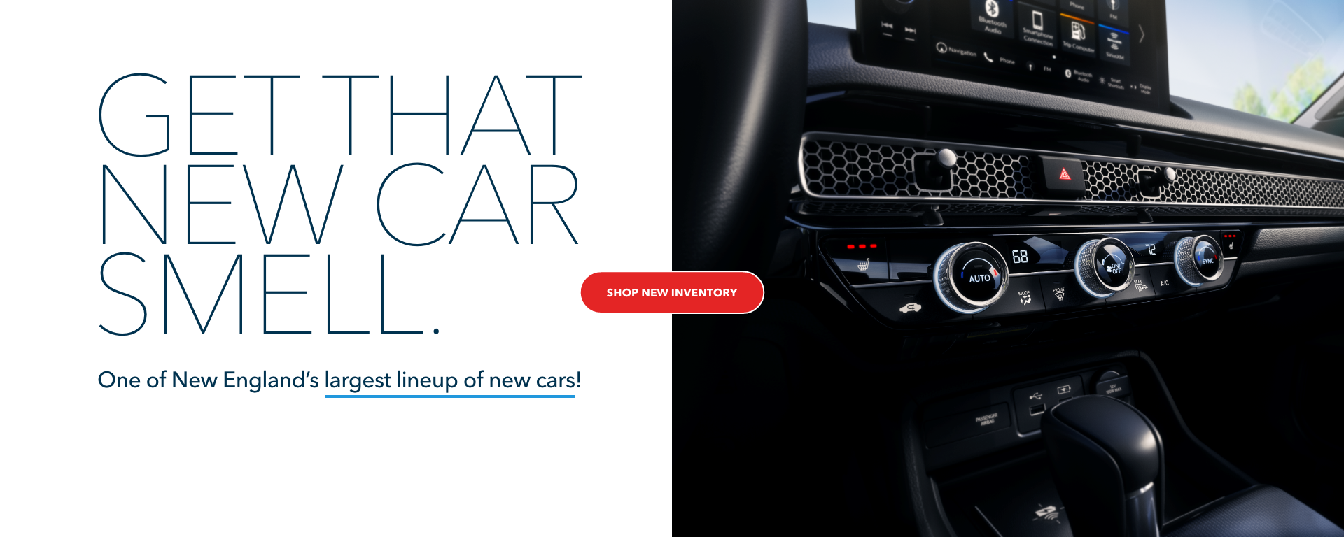
The banners above represent the original designs. We opted to retain the messaging while modifying the layout to achieve a more dynamic and engaging appearance.
CONCEPT DEVELOPMENT
The client was presented with three concepts, and they selected concept 2.
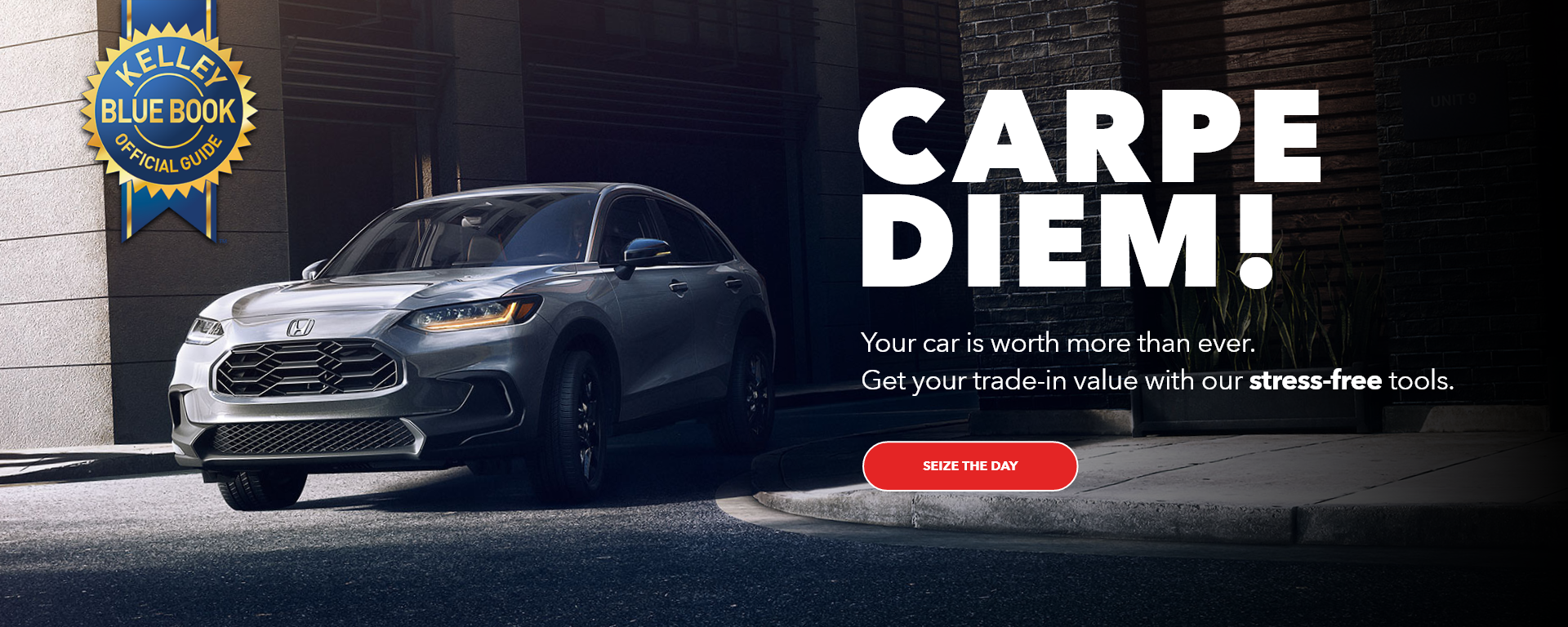
Concept 1
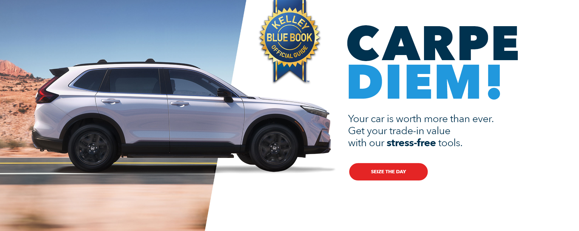
Concept 2
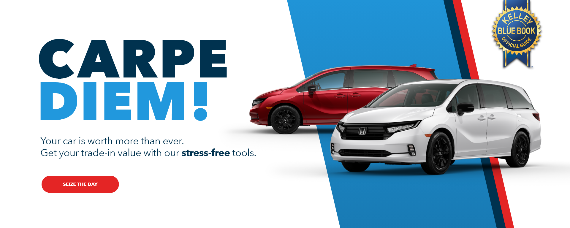
Concept 3
FINAL PRODUCT
Desktop Designs

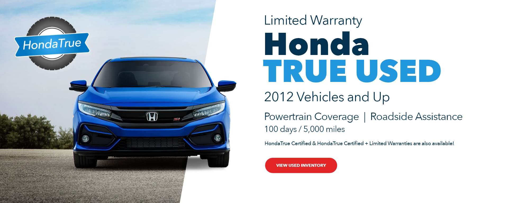
Mobile Designs



This project and it's assets belong to Team Velocity Marketing.